
How Displaying Abstract Figurative Canvas Prints Gives a Maximum Emotional Impact in Your Home
How to Display Abstract Figurative Canvas Prints for Maximum Emotional Impact in Your Home
Displaying abstract figurative canvas prints in your home is a brilliant way to infuse personality and emotion into your space. These artworks – which blend human forms with abstract colors and shapes – can set the mood of a room, spark conversations, and reflect your personal style. In this guide, we’ll explore how to maximize the emotional impact of these pieces through psychology, placement, room-by-room arrangements, and design cohesion. Follow along to transform your home into an artful haven filled with inspiration and feeling.
The Psychology of Abstract Figurative Art in Interiors
Abstract figurative art doesn’t just decorate a room – it shapes how the room feels. Colors, especially, play a powerful psychological role. For example, warm tones like reds, oranges, and yellows tend to stimulate energy and optimism, making a space feel lively and social, whereas cool tones like blues and greens evoke calmness and relaxation ( The Psychological Effects of Art in Interiors – Astawallart). Choosing a print with warm hues can inject passion and positivity into a living area, while cooler hues can create a soothing, tranquil vibe in a bedroom. Similarly, the forms and patterns in the artwork influence mood: soft, fluid shapes have a calming effect (significant for unwinding spaces) ( The Psychological Effects of Art in Interiors – Astawallart), whereas bold strokes or dynamic angles can energize the atmosphere. In fact, vigorous brushwork and a sense of movement in a painting can create a palpable sense of energy in the room (Exploring the Power of Colour in Abstract Art – ezeeart).
Abstract figurative pieces are also emotionally engaging because of their intentional ambiguity. Without a literal subject spelling out a story, viewers are invited to interpret the art in their own personal way. This open-ended quality means that as you or your guests gaze at the piece, each person might associate different memories or feelings with it (Abstract Art and the Concept of Ambiguity: Unveiling the Hidden Meanings – Artificial Paintings). The artwork becomes a bit of a visual puzzle for the mind – our brains actually enjoy trying to find familiar shapes or meaning in an abstract image, and feel rewarded when we “solve” it (The Psychology Behind Shape and Form | Ideelart). This process creates a deeper connection; the ambiguous forms allow you to project your own emotions onto the canvas, making the experience of the art highly personal and emotionally resonant (Abstract Art and the Concept of Ambiguity: Unveiling the Hidden Meanings – Artificial Paintings). In a home setting, that means your abstract figurative print isn’t just wall decor – it’s an ever-changing emotional landscape that can inspire, comfort, or intrigue every time you look at it.
Abstract Figurative Canvas Prints
Best Ways of Displaying Abstract Figurative Canvas Prints for Maximum Impact
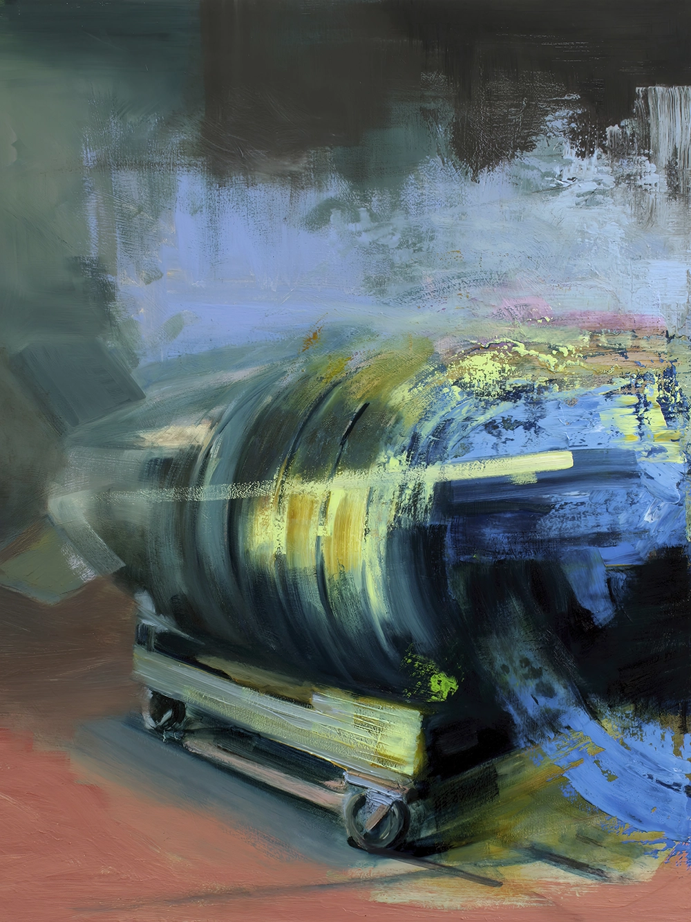
(Interiors – Painting Series | Bartosz Beda) Proper hanging and lighting make an abstract figurative canvas the focal point of this space. Note the even positioning and illumination, which draw the eye to the artwork without distraction.
How you position and illuminate your canvas prints can dramatically affect their impact. Keep these best practices in mind when hanging your abstract figurative art:
- Hang at Eye Level: Galleries and designers often follow the 57–60 inch rule – the center of the artwork should be around eye level (approximately 57–60 inches from the floor) for optimal viewing (Abstract Paintings for the Dining Room: Elevating Your Space with Art). In practical terms, this means you shouldn’t have to strain your neck up or down to enjoy the piece. If you’re hanging a canvas above furniture like a sofa or console table, leave about 6–8 inches of space above the furniture so the art remains connected to it visually, but not so low that it feels cramped. The goal is to make the art feel integrated with the room – a piece hung too high or too low can be easy to overlook or feel out of proportion.
- Consider Spacing and Alignment: Treat the group as one cohesive arrangement when hanging multiple canvases. Plan your layout on the floor first, experimenting with balance and order, then transfer it to the wall. Keep a consistent gap between frames – typically about 2–3 inches apart – so the collection reads as a unified display without awkward wide gaps (Hanging a 9 Frame Grid Gallery Wall — Stevie Storck). Align pieces along a common centerline or base line to create a pleasing visual harmony.
For example, when hanging two or three prints in a row, you might align their centers at the same height, or line up the tops/bottoms – either method can work as long as it looks deliberate. Also pay attention to proportions: a large statement canvas hung by itself can serve as a dramatic focal point, whereas a cluster of smaller prints can work together to fill a wall with equal impact. Just be sure that if you use a gallery-style grouping, the pieces have some relationship (by color or theme) so the grouping feels intentional. With thoughtful spacing and alignment, a collection of abstract figurative prints can appear organized and artful rather than cluttered. - Lighting is Key: The way you light your art can make or break its emotional impact. In fact, designers note that “there’s nothing better than a beautifully lit piece of art” and the right lighting will make your print shine (8 Tips for Lighting Art: How to Light Artwork in Your Home | Architectural Digest). Whenever possible, use dedicated art lighting or adjustable spotlights to illuminate the canvas. A common technique is to angle the light at about 30 degrees to the artwork from above (8 Tips for Lighting Art: How to Light Artwork in Your Home | Architectural Digest).
This angle evenly lights the image while avoiding harsh glare or long shadows. You can install ceiling-mounted accent lights or track lighting aimed at your prints to really make the colors pop in the evenings. Even a stylish picture light mounted on the frame can add a classic gallery touch while highlighting the piece. On the other hand, avoid direct sunlight on your canvases – not only can it cause colors to fade over time, but glare from sunlight will wash out the subtle details of the artwork. The right lighting draws eyes to your art and reveals its textures and brushwork, enhancing its emotional presence in the room. In a softly lit corner, a dimly viewed abstract might fall flat; but under a focused glow, every color and gesture comes alive, amplifying the mood it conveys.
By hanging your abstract figurative canvases at the proper height, with smart spacing, and lighting them thoughtfully, you ensure they command attention and resonate with anyone who enters the room.
Arranging Abstract Figurative Art in Different Rooms
Not every room in a home serves the same purpose or vibe, and your art can complement those differences. Here’s how to maximize the impact of abstract figurative prints in various rooms – from making a bold statement in social areas to cultivating calm in private spaces:
Living Room: Focal Points and Conversational Appeal
The living room is often the heart of the home – a place for gathering, entertaining, and relaxing – and it’s an ideal stage for a striking abstract figurative canvas. Make it a focal point: position a large canvas print above the sofa or mantle where it naturally draws the eye and anchors the seating area. This not only adds visual interest but can also tie the room’s decor together. A well-chosen piece here sets the tone for the entire space. For example, a print with warm, vibrant colors can inject energy and encourage social interaction (reds and oranges are known to inspire conversation and warmth, which is one reason they’re popular in lounges and restaurants) (Color Psychology in Interior Design – Renewal by Andersen). In fact, a bold artwork in the living room often becomes a great conversation starter – guests will naturally be curious and comment on it, sparking dialogue ( The Psychological Effects of Art in Interiors – Astawallart).
Arrange your seating to subtly face the art or use lighting to highlight it, inviting people to engage. To maintain balance, if your statement piece is very bright or complex, keep surrounding decor relatively neutral or pick up one of the artwork’s accent colors in your throw pillows and accessories. The result will be a living room that feels both stylish and inviting, with art that truly connects people in the space.
Bedroom: Creating Serenity and Introspective Depth
In a bedroom, art should help cultivate a sense of peace, intimacy, and personal reflection. Abstract figurative prints can be perfect for this – especially pieces that evoke calm emotions or thoughtful introspection. Aim for serenity: choose artwork with cooler colors or muted tones (blues, greens, soft neutrals) and gentle forms to promote relaxation ( The Psychological Effects of Art in Interiors – Astawallart). For instance, an abstract figure rendered in flowing lines or watercolor-like washes can introduce a peaceful presence. Such soft, organic patterns have a soothing effect that’s ideal for a space of rest ( The Psychological Effects of Art in Interiors – Astawallart). Hang your favorite canvas above the headboard or on the wall opposite the bed, where you’ll see it each morning and night.
The imagery – perhaps an indistinct human silhouette or a dreamy mix of hues – can provide a quiet focal point for reflection, helping to clear your mind at the end of the day or inspire introspection when you wake. Keep the bedroom’s overall design in harmony with the art: if the print has gentle, earthy colors, incorporate similar shades in your bedding or curtains for cohesion. Avoid overly busy or jarringly bright artworks here; the goal is an environment of comfort and contemplation. The right abstract figurative piece in a bedroom almost acts like a visual lullaby, adding depth to the room’s character while maintaining a tranquil atmosphere.
Dining Room: Stimulating Engagement and Adding Sophistication
A dining room is where you share meals and conversation – it can be both lively and elegant – and your choice of art can heighten that experience. Abstract figurative prints in a dining area should captivate and stimulate, without overpowering. One approach is to select a canvas that introduces a sophisticated color palette or motif to elevate the room’s ambiance. Dining rooms are a great place for art that feels a bit luxurious or dramatic, because it instantly dresses up the space. Imagine a large, expressive figurative abstract on one wall: it gives the room a point of interest beyond the dining table, and can even make dinners feel more special. Many people find that when they add compelling art in the dining room, their guests’ eyes light up with excitement, and it enhances the overall dining experience (Abstract Paintings for the Dining Room: Elevating Your Space with Art).
An engaging piece can spark conversations over dinner – perhaps the bold brushstrokes or intriguing figure in the painting prompts a discussion about art or emotions. To encourage a convivial mood, consider artworks with some warm tones or dynamic compositions here as well. Studies in color psychology note that warmer hues can subtly stimulate appetite and foster conversation, which is part of why you’ll often see reds or rich colors in restaurant decor (Color Psychology in Interior Design – Renewal by Andersen).
That doesn’t mean your print must be red or orange, but a lively mix of colors or an energetic scene can invigorate the space. At the same time, abstract art adds refinement – it shows an appreciation for creativity and can make the room feel like an upscale gallery dining experience. Frame the piece in a sleek frame (if it suits the style) to give it a finished look, and use accent lighting or a buffet lamp to gently illuminate it during gatherings. Your dining room art will not only add sophisticated flair but also contribute to the enjoyable, engaging atmosphere at every meal.
Office/Workspace: Enhancing Creativity and Reducing Stress
An office or workspace at home benefits greatly from art – the right piece can keep you inspired and at ease during the work day. Abstract figurative canvases work on two levels here: boosting creativity and providing stress relief. To spur creativity, choose artwork that has dynamic, vibrant elements or an imaginative theme. Studies have found that stimulating visuals can kickstart innovative thinking – for instance, a bold abstract with energetic colors and forms can literally stimulate your brain, encouraging innovation and problem-solving ( The Psychological Effects of Art in Interiors – Astawallart). Hang such a piece near your desk or in your line of sight; when you glance up from work, the burst of color and movement can refresh your mind and potentially lead to new ideas. Meanwhile, working long hours can be stressful, and art can serve as a mental escape.
Abstract art in particular is great for this – its ambiguity lets you momentarily lose yourself in interpretation. Taking a short break to gaze at a favorite canvas can be meditative. In fact, simply looking at art has been shown to lower stress, as it offers a mini mental vacation. A more contemplative abstract figurative print (perhaps with cooler, calming tones or a serene composition) can provide an emotional breather, allowing you to immerse yourself in the image and come back to tasks with a clearer head ( The Psychological Effects of Art in Interiors – Astawallart). Thus, balancing both kinds of pieces in a workspace – one energizing, one calming – is not a bad idea.
Alternatively, find a single artwork that mixes inspiring and soothing qualities (for example, a creative scene that isn’t too visually chaotic). Make sure the office decor and art mesh: you might use the artwork’s accent color in some office accessories or choose a frame that matches your furniture style. Overall, by incorporating abstract figurative art in your office, you create a workspace that fuels your creativity and keeps you emotionally balanced, turning your office into a place of both productivity and inspiration.
Entryway: Setting the Tone for the Home
Your entryway or foyer is the first space anyone sees when they come into your home – it’s your chance to make a great first impression and set the emotional tone for what’s inside. An abstract figurative canvas here can act as your home’s stylish handshake. Go for impact with meaning: select a piece that is visually striking and resonates with you personally, as this will both wow visitors and feel authentically “you.” For example, you might choose a canvas print that features a bold silhouette or an intriguing blend of colors that echoes your home’s overall color scheme. Hanging it in the entry immediately injects character into an otherwise utilitarian space. A well-placed artwork in the foyer can make even a small entry feel like a curated gallery.
It signals to guests that art (and by extension, emotion and creativity) is an important part of your home’s identity. In fact, the art you display is often a reflection of your personality and values, helping to reinforce your personal identity in your living space ( The Psychological Effects of Art in Interiors – Astawallart). So if you have a favorite abstract figurative piece that really speaks to you, the entryway is a perfect spot for it – it will communicate something about who you are to everyone who walks in. Additionally, such art can be a conversation piece right at the doorstep (“I love that painting by the door, it’s so interesting!”).
For practical matters, ensure the piece isn’t too large for the wall (you don’t want to overwhelm a tight foyer) and consider pairing it with a mirror or console table for a balanced vignette. Good lighting is useful here as well – a pendant light or wall sconce can illuminate the art and make the space feel warm and welcoming at night. Done right, an abstract figurative print in the entryway will set the mood for your entire home, whether that’s cozy and contemplative, bright and energizing, or anything in between, and it tells a story before guests even enter your living room.
Practical Tips for Cohesion in Interior Design
Once you’ve chosen and placed your abstract figurative canvas prints, you’ll want to ensure they feel harmonious with the rest of your interior decor. Here are some practical, research-backed tips to create cohesion between your artwork and your design scheme:
- Coordinate Color and Style: To make your art and furnishings feel unified, find a common thread between them. You can either pull a dominant color from the artwork and echo it in the room’s accents (like pillows, rugs, or curtains), or use contrasting colors intentionally for drama – but make sure it looks deliberate. The key is that the artwork should complement the room’s color palette and style, not clash with it (Incorporating Art into Your Interior Design).
For instance, a modern abstract print with lots of teal and gold will sing if you have a few other teal or gold elements in the space, or if the rest of the room is in neutral tones that make those colors pop. Similarly, match the intensity: a muted, pastel-toned painting fits well in a room with soft, light-colored decor, whereas a high-energy, neon-colored canvas might be best in a more minimal or monochromatic room that can handle the visual excitement. This way, the art feels like an integrated part of the design. - Balance Boldness and Scale: Consider the size and visual weight of your art relative to the room. A huge, vividly colored canvas can be a stunning centerpiece, but if the room is tiny or filled with other statement pieces, it might overwhelm the space. Designers advise choosing wall art that enhances the room without overpowering it (Incorporating Art into Your Interior Design). One rule of thumb: if hanging art above a piece of furniture (like a sofa or bed), aim for the artwork (or grouping of artworks) to be about two-thirds the width of the furniture piece – this generally looks proportionate.
Also balance bold with subtle: if your canvas print is full of pattern and color, surrounding it with too many other bold patterned furnishings can create visual chaos. Instead, let that print be the star and keep other elements a bit more subdued. Conversely, in a very neutral or minimalist room, don’t be afraid to choose a really vibrant or large-scale abstract piece – it can inject personality and prevent the space from feeling flat. The idea is to let your art and furniture complement each other in scale and presence, each shining without one eclipsing the other. - Framing and Presentation: Decide whether you want your canvas prints framed or unframed, and be consistent with your choice across a room for a cohesive look. Framed canvas art tends to give a more traditional, polished feel, tying in with other framed elements or classic decor, while unframed (gallery-wrapped) canvases offer a contemporary, minimalist vibe ( Does unframed canvas look good? – Buy Wall Art ). Neither is “right” or “wrong” – it depends on your interior style. For example, if your living room furniture and style leans modern or scandi minimalist, you might opt to hang your abstract prints unframed for a clean edge that blends into the wall.
On the other hand, adding a float frame or a simple black/wood frame around the canvas can make it look more formal and contained – great for transitional or traditional interiors where you want the art to feel a bit more anchored. Frames can also tie the art to other design elements (a black frame might echo a black metal coffee table, or a brass frame might pick up the brass in a light fixture). Whichever route you choose, keep the framing style consistent in a given space. Mixing too many frame colors or types in one room can become distracting. If you do mix framed and unframed pieces intentionally, do so in a considered way (for instance, all the large pieces unframed and smaller ones framed in the same color frame) so that the result is an eclectic yet cohesive gallery. - Create Themed Groupings: If you’re displaying multiple art pieces together (say, a gallery wall or several canvases in one room), curate them with some unifying element for harmony. This could be a common theme, color scheme, or artistic style that runs through each piece (Incorporating Art into Your Interior Design). For example, you might group all figurative abstracts that feature the human form in some way, even if their colors differ. Or you could create a mini gallery of black-and-white abstract prints alongside one another. Having that thread will make the collection feel intentional.
A set of wildly different artworks can still work together if you frame them all similarly or arrange them in a balanced layout, but generally a bit of commonality helps. The benefit is twofold: your collection will look curated and cohesive, and it will also enhance the emotional impact – a series of pieces that relate can tell a larger story or amplify a mood. As one interior design expert notes, grouping artworks that share a common element creates a unified look and can turn a simple gallery wall into a unique expression of your taste (Incorporating Art into Your Interior Design). So whether it’s a consistent color family (e.g., shades of blue across different prints) or a repeated motif (such as abstract faces or figures appearing in each piece), find a way to tie your art arrangement together with a cohesive thread.
By applying these tips, you’ll ensure your stunning abstract figurative prints don’t feel like isolated add-ons, but rather as integral parts of your interior design. When colors echo, proportions make sense, and styles complement each other, the whole room comes together and the emotional impact of your art is magnified. Ultimately, the goal is a harmonious space where art and decor speak the same language – a language that reflects you and the atmosphere you want in your home.
Sources:
- Bartosz Beda – Official Website (https://bartoszbeda.com/)
- Bartosz Beda Studio – Artist Blog (https://studio.bartoszbeda.com/)
- Ezeeeart – Exploring the Power of Colour in Abstract Art (Exploring the Power of Colour in Abstract Art – ezeeart) (Exploring the Power of Colour in Abstract Art – ezeeart)
- IdeelArt – The Psychology Behind Shape and Form (The Psychology Behind Shape and Form | Ideelart)
- Artificial Paintings – Abstract Art and the Concept of Ambiguity (Abstract Art and the Concept of Ambiguity: Unveiling the Hidden Meanings – Artificial Paintings)
- AstA Wall Art – The Psychological Effects of Art in Interiors ( The Psychological Effects of Art in Interiors – Astawallart) ( The Psychological Effects of Art in Interiors – Astawallart) ( The Psychological Effects of Art in Interiors – Astawallart) ( The Psychological Effects of Art in Interiors – Astawallart) ( The Psychological Effects of Art in Interiors – Astawallart)
- Architectural Digest – 8 Tips for Lighting Art (8 Tips for Lighting Art: How to Light Artwork in Your Home | Architectural Digest)
- Renewal by Andersen – The Psychology of Color in Interior Design (Color Psychology in Interior Design – Renewal by Andersen)
- Osnat Fine Art – Abstract Paintings for the Dining Room (Abstract Paintings for the Dining Room: Elevating Your Space with Art) (Abstract Paintings for the Dining Room: Elevating Your Space with Art)
- Anthony Michael Interior Design – Incorporating Art into Your Interior Design (Incorporating Art into Your Interior Design)
- BuyWallArt – Framed vs Unframed Canvas ( Does unframed canvas look good? – Buy Wall Art )
- Stevie Storck – Hanging a Grid Gallery Wall (Hanging a 9 Frame Grid Gallery Wall — Stevie Storck)

