
How Should You Light and Display an Abstract Figurative Painting to Emphasize Its Dual Nature?
How Should You Approach Lighting and Displaying Abstract Figurative Paintings to Highlight Their Dual Nature?
Home décor guides often give generic art lighting tips but rarely address the unique needs of displaying abstract figurative paintings. These hybrid artworks hide recognizable figures within swirls of color or heavy textures, requiring careful lighting to reveal their secrets. Below, we explore how to use ambient vs. accent lighting, strategic angles, and home display tricks to highlight an abstract figurative painting’s dual nature.
Understanding the Dual Nature of Abstract Figurative Paintings
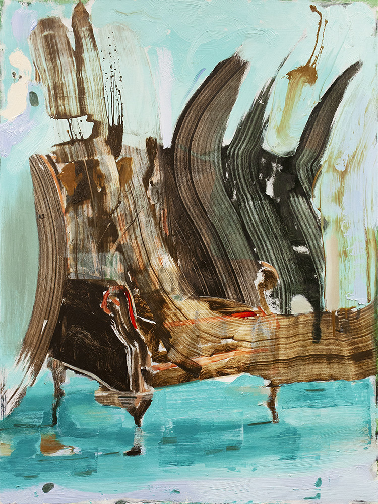
Abstract figurative paintings balance non-representational brushwork with hidden imagery. At first glance they may appear purely abstract, but closer inspection reveals figures or faces emerging from the chaos. Many contemporary artists embrace this duality.
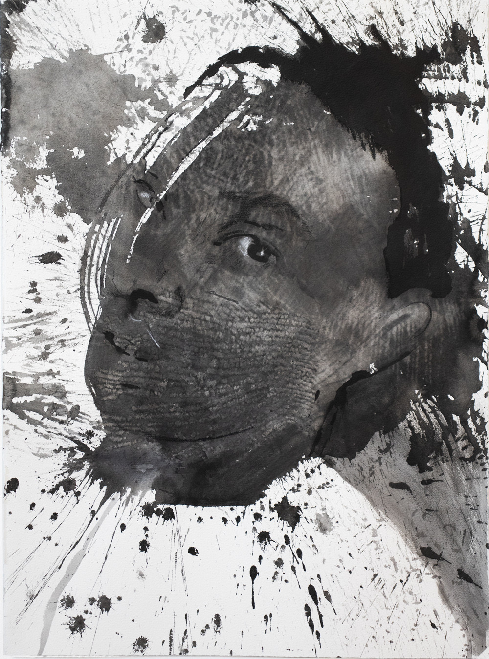
For example, Frank Auerbach uses boldly gestural strokes and inch-thick impastos so that his portraits “emerge from the canvas and dissolve into the paint,” making features almost vanish under viscous layers (Frank Auerbach Paintings, Bio, Ideas | TheArtStory) (Frank Auerbach Paintings, Bio, Ideas | TheArtStory). His figures are present yet obscured, as if the viewer must excavate the image from the sculptural paint.
Gerhard Richter, by contrast, often employs a blurred finish on his figurative images. He famously said, “I blur things to make everything equally important and equally unimportant,” using this technique to eliminate hard details and meld figure with background (Art » Quotes » Gerhard Richter).
Cecily Brown also embraces ambiguity – her canvases “fluctuate in the hazy area between figuration and abstraction” with figurative elements engaged in a visual tug-of-war (Cecily Brown’s Art For Sale, Exhibitions & Biography | Ocula Artist). Brown notes that her natural state is “being torn” between the two, and she deliberately makes the viewer strain to discern images hidden in a “kaleidoscope of colour and painterly marks.” (Cecily Brown’s Art For Sale, Exhibitions & Biography | Ocula Artist)
Jenny Saville, likewise, builds up thick paint and overlapping bodies so that multiple figures intertwine. In some of her works, drawn charcoal lines overlap “multiple figures in order to evoke movement, memory, and time,” leaving forms only partially visible (Jenny Saville Paintings, Bio, Ideas | TheArtStory).
In all these cases, the painting’s meaning emerges through an interplay of surface texture and suggested form. Lighting plays a critical role in amplifying this interplay. The right lighting can sculpt the paint surface with shadows and highlights, bringing out hidden faces or forms. Conversely, poor lighting might flatten the texture or wash out subtle details, causing the figurative elements to remain overlooked. A well-lit abstract figurative piece will let viewers experience the “push-pull” between abstraction and representation that the artist intended. Effective display involves not just hanging the artwork, but actively using light to guide the eye toward those semi-concealed figures without destroying the piece’s abstract allure.
Best Lighting Conditions for Abstract Figurative Art
To showcase such a painting at home, you’ll want a thoughtful mix of ambient and accent lighting. Ambient lighting is your general room illumination – it ensures overall visibility and comfort. Accent lighting is focused light dedicated to highlighting the artwork. For an abstract figurative piece, the accent light is what will draw attention to the painting and reveal its depth. As a rule of thumb, experts suggest the art’s lighting be about three times brighter than the room’s ambient light (3 Important Tips for Properly Lighting Your Artwork). This contrast makes the painting pop as a focal point. You can achieve this by using adjustable spotlights, track lights, or picture lights aimed at the artwork, while keeping the room’s other lights softer. Do avoid any direct harsh light aimed straight on, though – we want to illuminate the art, not create glare.
Color temperature is another important factor. The warmth or coolness of the light can subtly affect how colors and tones in the painting appear. Many museums and galleries stick to a neutral-white light (around 3000–3500K) to render colors accurately without a strong yellow or blue cast (Art Lighting: Seeing Art in the Best Light [5-step Guide]). For home settings, a similar approach works well.
A “warm” white light (2700K–3000K) can enrich reds and earth tones (nice if your painting has a lot of warm hues or if you want a cozy feel), whereas a “cool” white (4000K) might sharpen blues and greys and can suit ultra-contemporary pieces (Art Lighting: Seeing Art in the Best Light [5-step Guide]). The key is consistency – use the same color temperature in all lights illuminating the artwork, so one part of the canvas doesn’t look oddly bluer or yellower than another. Also look for bulbs with a high Color Rendering Index (CRI). High CRI (close to 100) means the light shows colors faithfully. This is crucial for art; low-CRI lights can make colors appear dull or distorted. Aim for CRI 90+ if possible so that the painting’s true palette shines through (3 Important Tips for Properly Lighting Your Artwork).
Light placement and type will affect how well you see both the texture and the figurative details. Ceiling-mounted accent lights (like track lights or recessed spotlights) are excellent because you can aim them precisely without the fixture itself becoming a distraction (8 Tips for Lighting Art: How to Light Artwork in Your Home | Architectural Digest). A common guideline is to position a spotlight so that its beam hits the center of the artwork at about a 30-degree angle from the vertical (8 Tips for Lighting Art: How to Light Artwork in Your Home | Architectural Digest). This angle tends to minimize glare on canvases and glass, while evenly lighting the piece top to bottom.
If you mount a light too close to the wall (say a very steep angle of 10–15 degrees), you risk long shadows on the textured surface and on the wall below the frame (8 Tips for Lighting Art: How to Light Artwork in Your Home | Architectural Digest). Too shallow an angle (over 45 degrees) and the light can hit the canvas too directly, causing specular glare or washing out the image (8 Tips for Lighting Art: How to Light Artwork in Your Home | Architectural Digest). So that 30° sweet spot is a great starting point. From there, you can fine-tune: if the artwork is large or has a thick frame, you might go to ~35° to cover it fully (3 Important Tips for Properly Lighting Your Artwork). If the painting has pronounced texture that you want to emphasize, you might decrease to ~25° to rake the surface with light (3 Important Tips for Properly Lighting Your Artwork). We’ll talk more about angles and texture next.
In summary, light your abstract figurative painting with dedicated accent lighting that’s brighter than the room, choose a neutral/warm-white LED with high CRI for true color, and position lights at an angle that avoids glare while covering the whole canvas. This creates an optimal baseline where the piece is evenly visible and colors are vibrant. From here, you can get creative with angle adjustments and additional lights to really make those hidden figures jump out.
Using Angles and Shadows to Highlight Texture
One of the most exciting aspects of abstract figurative art is texture: thick paint ridges, palette-knife swipes, layered glazes. The way light hits these textures can dramatically change the painting’s appearance. By adjusting the angle of light or using shadows deliberately, you can either enhance the tactile dimension (bringing the abstract textures forward) or soften them to let the figurative image read more clearly.
For heavily textured paintings (think of Auerbach’s impasto surfaces built up with peaks and valleys of paint), raking light is incredibly effective. Raking light means shining the light at a very low angle almost parallel to the canvas, so that it “rakes” across the surface. This casts longer shadows in the paint’s recesses and bright highlights on the raised areas. As a result, every bump and ridge in the paint stands out. Even a slight change – mounting your picture light 5° lower than the standard 30° – will accentuate texture (3 Important Tips for Properly Lighting Your Artwork).
In fact, lighting specialists note that the more you move the light to the side, the stronger the texture will appear, whereas front lighting can make texture look flat (Texture Painting Techniques). At home, you might achieve raking light by using an adjustable track light angled from one side, or even by adding a second light source hitting the canvas from a sharp side angle. When done right, this technique makes thick brushstrokes throw tiny shadows that bring the surface relief to life. An impasto-heavy painting under raking light almost transforms into a low-relief sculpture – you’ll see forms emerge in the shadows that weren’t visible under flat lighting.
For example, a Frank Auerbach portrait lit from the side will reveal the “massed ripples and strings of paint” that can obscure the face (Frank Auerbach: a painter’s painter of horrors and joy – The Guardian). Those ripples catch the light and create contrast that emphasizes the abstract quality of the paint. In a way, you are visually sculpting the painting with light. Museum guidelines often suggest a 25° light angle for highlighting textures (3 Important Tips for Properly Lighting Your Artwork) – this is essentially raking light that makes thick paint pop. One art lighting guide explains that with a single directional light, a “sculptural impasto work” gains depth as “light reflects off the high points and casts textural shadows.” (Representing Textual Paintings on Screen). This is ideal if you want to celebrate the painting’s abstract, physical presence.
On the other hand, if the artwork’s surface is relatively smooth or the artist employed delicate glazing and blending (for instance, Gerhard Richter’s blurred figures or blended layers in some abstract works), harsh shadows might be undesirable. Softer, diffused lighting becomes the better choice. Diffused or “even” lighting can be achieved by using multiple light sources from different directions (which cancel out each other’s shadows), or a broader light that blankets the canvas more uniformly.
This minimizes any one strong shadow and lets you see the subtle tonal shifts or translucent layers without distraction. As one painting guide notes, “Even light, or multiple lights from opposite directions, will cancel out textural shadows and emphasize the true color mixtures on the surface.” (Representing Textual Paintings on Screen) For a piece that relies on gentle transitions and implied forms (like a Richter where the image is foggy, or a Cecily Brown where forms are hidden in swirling brushwork), such even lighting helps the viewer focus on those elusive figurative elements rather than on surface glare. If you have a painting with glossy varnish or very fine texture, diffused lighting prevents specular highlights (bright spots) that might otherwise obscure details.
In practical terms, you can achieve softer lighting by using a wide flood bulb instead of a narrow spotlight, backing the light further away, or supplementing the main light with a secondary light on the opposite side to fill in shadows. The goal is to reduce the contrast of any single light source. Note that this doesn’t mean making the painting flat or dull – it just means you’re not exaggerating the texture. For example, Gerhard Richter’s blurred portraits often have very slight texture from brushwork; a strong side light could create tiny shadows that actually interfere with the illusion of a smooth blur. A more head-on, diffused light would keep the focus on the image itself (the figurative content) by “emphasizing the true color mixtures” and not adding new visual noise (Representing Textual Paintings on Screen).
Many abstract figurative works fall somewhere in between heavy impasto and glassy smoothness. You might need a balanced approach: a primary light at ~30° for overall illumination and a gentle raking light at low intensity from one side to give a hint of shadow. It may take a bit of experimenting – try dimming one light or changing angles and observe how the textures and hidden shapes respond. Remember, even a small shift in angle can change whether a brushstroke casts a shadow or not. As one lighting expert succinctly puts it: “If the light is from the front, the texture will appear flat… The more you move the light to the side, the stronger the texture will appear.” (Texture Painting Techniques) Use that principle to your advantage depending on what you want to emphasize: abstract texture or the painted image.
Guiding the Viewer’s Eye: Lighting to Reveal Hidden Figures
Abstract figurative paintings often contain “Easter eggs” – those hidden figures or faces that suddenly become clear when you notice them. Thoughtful lighting can help guide a viewer’s eye to these figurative elements without spoiling the game of discovery. The trick is to use light intensity, contrast, and positioning to create a visual path for the viewer.
One strategy is to highlight key focal points of the composition. Even if the painting is partly abstract, usually the artist has some intended focal area (often where the figure resides or emerges). You can use a slightly brighter or more focused beam on that section of the canvas. According to lighting designers, “Lighting can be used strategically to emphasize specific areas or elements within the artwork. This helps guide the viewer’s attention to key focal points.” (Art Lighting: Seeing Art in the Best Light [5-step Guide]).
For example, if your painting has a semi-hidden human face in the upper right, you might angle one accent light specifically toward that area or use a narrow beam spotlight to give it a touch more illumination relative to the surroundings. The increased brightness or contrast on that spot will naturally draw the eye there first. Our eyes are attracted to brighter areas and areas of higher contrast. By making the figurative element just a bit more luminous, you make it more likely the viewer will notice it in the sea of abstraction.
Another technique is layering light sources to create depth. Instead of relying on one light, use multiple lights with different intensities. For instance, one could be a strong primary light at a 30° angle covering most of the piece, and another could be a weaker light from a different angle that just fills in shadows on one side. This layered lighting can add dimensionality—almost like a gentle spotlight effect—where the figure “pops” forward. If the painting is large, you might even use three or four small LED spotlights, each aimed at different sections of the canvas. This way you can subtly tune which sections get more light. Be careful not to overdo it (you don’t want the painting looking inconsistently lit), but a slight intentional imbalance can work wonders. Contrast is key: the figurative element should have a bit more light-dark contrast than the purely abstract background areas. That might mean ensuring any shadows around the textured edges of the figure are a tad darker (by not filling them entirely with ambient light) while the figure itself is well-lit. Conversely, the surrounding abstract zones might be lit more evenly or softly so they don’t compete for attention.
You can also play with shadow angles to outline forms. Suppose the hidden figure is created by relief in the paint (e.g. a silhouette formed by thicker paint). A light from the side can cast a shadow that outlines that silhouette more clearly, essentially tracing the figure in light and shadow. This works especially for abstract sculptures or very textured canvases where the figure is in relief. However, for two-dimensional illusions of figures (like Richter’s blur or Brown’s camouflage of figures), it’s more about light intensity and color. In those cases, contrast and color temperature differences can guide the eye. A slightly cooler light could be used on one side of the canvas if, say, the figure is painted in cooler tones, to accentuate those cool colors against a warmer ambient light. Usually though, maintaining a uniform color temperature is recommended for consistency (Art Lighting: Seeing Art in the Best Light [5-step Guide]) – so focus mostly on intensity and direction for emphasis.
Finally, consider the viewer’s position relative to the lighting. If possible, arrange your lighting so that as the viewer moves (or as they enter the room), the lighting effects reveal the figure in a kind of reveal or surprise. For instance, one might notice a glint of highlight that resolves into the shape of a face only from a certain angle. This is a more advanced, almost theatrical approach to viewing art at home. It might involve a spotlight with a narrow beam that only fully illuminates the figure when viewed head-on. This way, the process of walking around the room can itself guide the eye – a moving highlight can catch someone’s peripheral vision and direct them to look closer at the painting.
In summary, use your lighting setup to point out the painting’s secrets: brighter focused light on the figurative zones, layered and directional lighting to add depth, and controlled contrast to ensure the hidden image isn’t lost in uniform brightness. As one lighting guide suggests, combining ambient and accent lighting creates a dynamic environment (Art Lighting: Seeing Art in the Best Light [5-step Guide]) – here, the ambient light gives the overall context while your accent lights pinpoint the artwork’s storytelling elements. Done right, the viewer’s eye will naturally gravitate to the hinted figure and then wander back out to appreciate the surrounding abstraction, cycling between the two in an engaging visual journey.
Home Gallery Setup: Positioning and Framing Abstract Figurative Paintings
Beyond the lights themselves, how and where you display the painting in your home will impact its effect. Treat your space like a mini gallery. Here are some tips on positioning, mounting, and integrating the artwork into your décor for maximum impact:
- Hang at the right height: Galleries typically hang art so that the center is around eye-level, often about 57 inches from the floor (Three Simple Rules to Follow When Hanging Art in Your Home). This is a good rule for home, too. Centering the abstract figurative painting at eye level ensures viewers can comfortably engage with both its overall composition and its finer details without straining.
If the painting is very large or you anticipate mostly viewing it while seated, you can adjust a few inches, but the goal is to avoid a placement that’s too high (where the lighting angle might cause glare and the top is hard to see) or too low (where perspective distortion and floor reflections could interfere). Eye-level placement is especially important for abstract figurative works because seeing them straight-on (not severely angled above or below) helps maintain the intended perspective where hidden figures resolve correctly. - Choose a suitable wall and backdrop: Where possible, position the painting on a wall that doesn’t get direct sunlight. Direct sun can fade artwork and also create excessive glare at certain times of day (3 Important Tips for Properly Lighting Your Artwork) (8 Tips for Lighting Art: How to Light Artwork in Your Home | Architectural Digest). A spot with controllable artificial lighting is preferable. Also consider the wall color – neutral tones (white, grey, soft earth colors) often work best as they don’t cast strong color reflections onto the artwork. A bright red or green wall could actually tint the light that bounces onto your painting, subtly skewing its color balance. Light-colored walls or even mirrors can be used strategically around the painting to bounce light and amplify illumination in the room (Art Lighting: Seeing Art in the Best Light [5-step Guide]).
For instance, a mirror opposite your accent light can reflect some light back onto the canvas for a gentle fill (just be mindful of creating any secondary glare). The surrounding décor should support the viewing experience: if you have a lot of shiny surfaces near the painting (glass tables, metal lamps), check for undesired reflections or hot spots on the canvas. Sometimes angling the lights a bit more or repositioning reflective objects can solve this. - Use multiple light sources for an immersive effect: In a dedicated home gallery area, don’t be afraid to layer several lights. You might have a primary ceiling spotlight and supplement it with a picture light on the frame, plus perhaps a floor lamp that adds ambient glow. Multiple light sources at various heights can create a more immersive gallery atmosphere, making the artwork feel integrated into the room’s environment.
For example, a ceiling track light provides the main illumination on the painting, while a wall sconce or picture light adds a gentle wash from above, and a floor uplight can graze the wall below the piece, reducing stark shadows. This multi-source approach can make the artwork almost glow. Just remember to aim each light thoughtfully so they complement rather than compete. When layering lights, it’s often effective to set them at different brightness levels: your main accent light bright, the supplementary ones dimmer, creating a hierarchy of light that guides the eye (as discussed in the previous section). - Framing and glass considerations: Abstract figurative paintings are often on canvas and displayed without glass (especially if they have thick texture, as glass can compress or obscure it). If your piece is unframed canvas, you might consider a simple floater frame or no frame for a contemporary look. If it is behind glass or acrylic (for instance, if it’s a work on paper or a thinner paint layer you chose to frame), then be extra careful with lighting angles. Glass can produce strong reflections; the 30° rule for lights is crucial here to minimize glare bouncing back at the viewer (3 Important Tips for Properly Lighting Your Artwork).
You can also invest in anti-reflective museum glass if framing—a bit pricier but it dramatically cuts glare. As for the frame style, a minimal frame in a neutral color or natural wood often suits abstract works, letting the painting itself take focus. A heavy, ornate frame might conflict with the modernist nature of many abstract figurative pieces, but there are exceptions depending on personal taste. If the frame is very thick or has a wide mat, ensure your lighting angle is adjusted (about +5°) to account for the larger border so that the light reaches the lower parts without the frame casting a shadow (3 Important Tips for Properly Lighting Your Artwork). - Avoiding glare and heat: Whichever lighting you use, position fixtures so they do not shine directly into viewers’ eyes or reflect off the canvas. Sometimes a slight tilt or using a baffled light can help. Also, check that lights aren’t so close that the artwork feels heat – high heat can damage paintings over time (3 Important Tips for Properly Lighting Your Artwork) (3 Important Tips for Properly Lighting Your Artwork). LEDs are generally cool, but halogen or incandescent accent lights should be used with caution or UV/heat filters. Do the hand test: put your hand between the painting and the light; if you feel warmth, the light is too close or intense (3 Important Tips for Properly Lighting Your Artwork). Back it off to protect the piece.
- Integrate with décor thoughtfully: Lastly, consider the room’s overall design. Your abstract figurative painting is likely a focal point, so arrange furniture and other décor to support that. Maybe position a chair or sofa at a good viewing distance, and use a rug or floor color that doesn’t reflect oddly. If you have other artworks, give this piece some breathing room so it doesn’t have to compete immediately with another bold piece.
You can absolutely make a gallery wall, but for an artwork with intricate dual nature, it often warrants a wall section on its own or at least enough space that a viewer can stand and contemplate it. Reflective surfaces nearby (like a grand piano, a TV, or polished stone) can sometimes mirror the painting or the light – decide if that’s distracting or if it adds an interesting echo. In some cases, a well-placed mirror can allow a viewer to see the painting from another angle (even catching the raking light effect in the reflection). It can also increase the sense of depth in the room, enhancing how the painting’s presence is felt. The key is to avoid anything that inadvertently steals the spotlight from your art or muddles the carefully arranged lighting.
By treating installation and lighting with the same artistry as the painting itself, you create a home gallery experience where the artwork truly sings. An abstract figurative painting, illuminated and positioned thoughtfully, will reward viewers with an engaging dance between its two natures – the abstract textures and colors that excite the eye and the figurative imagery that engages the mind. In your home, this means a distinctive and captivating display piece that transcends mere decoration and becomes an interactive visual experience.
References
- Park West Gallery – “3 Important Tips for Properly Lighting Your Artwork.” (3 Important Tips for Properly Lighting Your Artwork) (3 Important Tips for Properly Lighting Your Artwork)
- Architectural Digest – “8 Tips for Lighting Art: How to Light Artwork in Your Home” (Tim McKeough, 2018) (8 Tips for Lighting Art: How to Light Artwork in Your Home | Architectural Digest)
- Alcon Lighting – “Art Lighting: Seeing Art in the Best Light” (5-step gallery lighting guide) (Art Lighting: Seeing Art in the Best Light [5-step Guide]) (Art Lighting: Seeing Art in the Best Light [5-step Guide])
- Oil Painters of America – Rob Rey, “Representing Textural Paintings on Screen” (2017) (Representing Textual Paintings on Screen) (Representing Textual Paintings on Screen)
- PaintBasket Art Tutorials – “Texture Painting Techniques” (n.d.) (Texture Painting Techniques)
- The Art Story – “Frank Auerbach Artist Overview and Analysis.” (Frank Auerbach Paintings, Bio, Ideas | TheArtStory) (Frank Auerbach Paintings, Bio, Ideas | TheArtStory)
- Gerhard Richter – Notes and Quotes on Techniques (1964–65) (Art » Quotes » Gerhard Richter)
- Ocula Magazine – “Cecily Brown Biography” (Cecily Brown’s Art For Sale, Exhibitions & Biography | Ocula Artist) (Cecily Brown’s Art For Sale, Exhibitions & Biography | Ocula Artist)
- The Art Story – “Jenny Saville Artist Overview and Analysis.”


