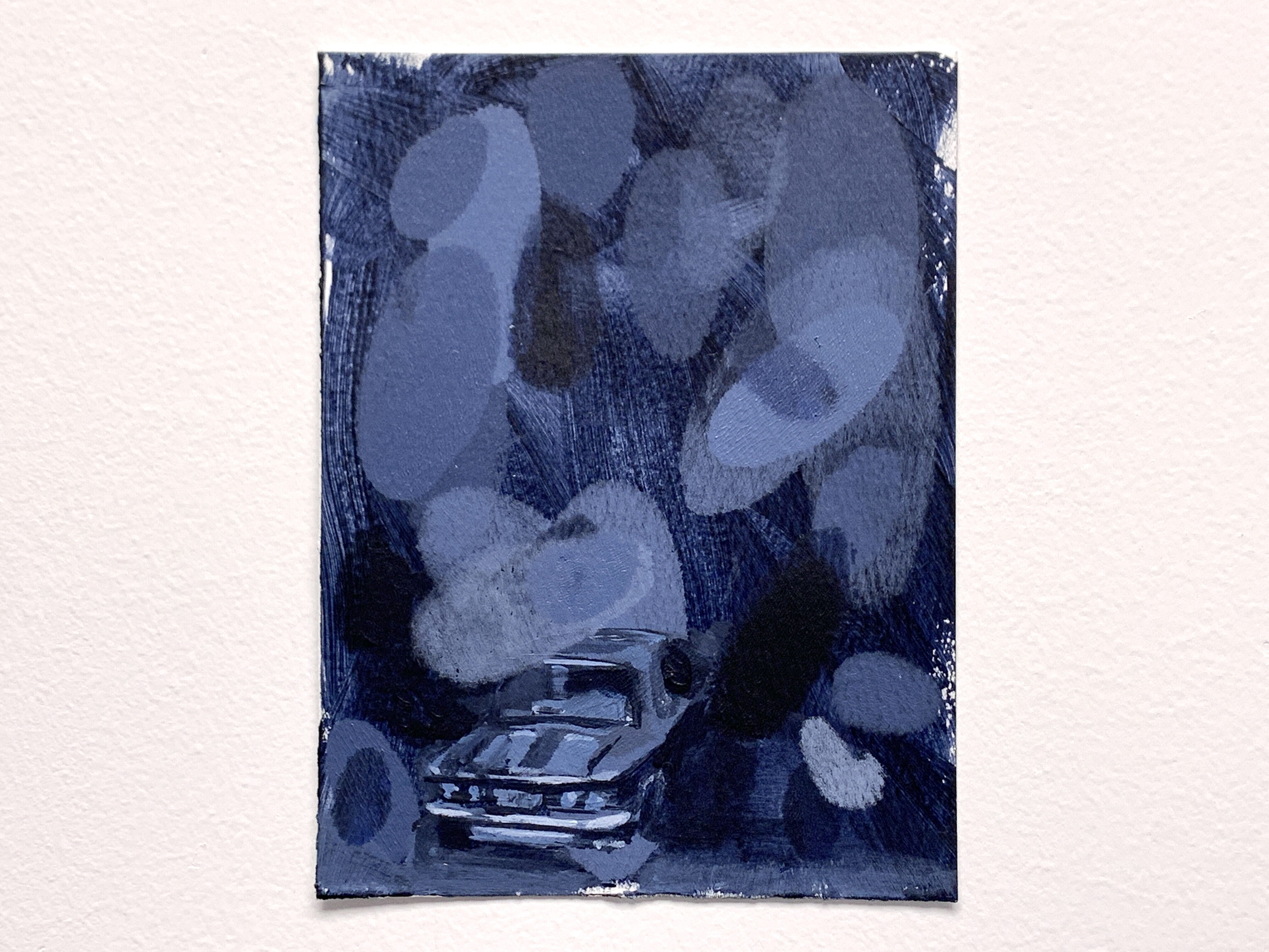
Absolute Color 02 | Small Original Painting | Bartosz Beda
Absolute Color 02 by Bartosz Beda – acrylic on paper, 6×4.5 inches (2025). This small painting brims with bold textures and layered hues, exemplifying Beda’s abstract figurative style.
Absolute Color 02, acrylic on paper, 6×4.5 inches (15x11cm), 2025
$100.00
Out of stock


Description
Absolute Color 02, acrylic on paper, 6×4.5 inches (15x11cm), 2025
Painting Information
| Attribute | Value | Attribute | Value |
| Condition | Handmade | Artist | Bartosz Beda |
| Unit of Sale | Single Piece | Signed By | Bartosz Beda |
| Size | 6×4.5 inches (15x11cm) | Signed | Yes |
| Period | Ultra Contemporary (2020 – Now) | Material | Watercolor Paper |
| Region of Origin | Texas, USA | Framing | Unframed |
| Subject | Art, Landscape, House | Personalize | No |
| Type | Painting | Year of Production | 2025 |
| Original/Reproduction | Original | Theme | Representational, Abstract |
| Style | Abstract Figurative | ||
| Features | One of a Kind (OOAK) | Technique | Acrylic on paper |
| Country | United States | ||
| Handmade | Yes |
Absolute Color 02: A Poetic Exploration of Bartosz Beda’s Luminous Ambiguity
Between Figuration and Abstraction – A Vision in Color
At first glance, Absolute Color 02 greets the eye as a storm of color and motion. Turbulent swaths of paint collide across the small 6×4.5 inch surface, creating an image that is both vibrant and elusive. Within the chaos of brushstrokes, one senses the ghost of a figure or form emerging – perhaps the angled roofline of a house or the faint curve of a shoulder – yet nothing solidifies into a fully identifiable subject. This is the hallmark of Bartosz Beda’s abstract figurative technique: he fuses recognizable hints of reality with gestural abstraction so that the painting hovers on the edge of legibility. Beda himself describes his process as beginning “with an abstract image” from which a figure emerges, achieving a “perfect marriage” of representation and abstraction where neither aspect “overpower[s] the other” (studiointernational.com). In Absolute Color 02, this balance is palpable – the composition lives in a liminal space between presence and absence, inviting us to oscillate between seeing something and surrendering to pure color, much like spotting shapes in clouds only to have them dissolve before certainty can take hold.
This intentional ambiguity in Beda’s work produces a sense of mystery. The partially obscured figure – a silhouette submerged in color – acts as an anchor for our perception even as it remains enigmatic. Our brains are wired to seek familiar forms; given the slightest suggestion of a human or an object, we latch on and fill in the rest with imagination. Beda plays with this psychological tendency, providing just enough detail (a contour here, a contrast in value there) to spark recognition, then immediately disrupting it with bold strokes of paint. Faces and bodies are often blurred or “smeared into a swirl of paint” in his paintings (store.bartoszbeda.com), erasing individual identity and rendering the figure universal and open-ended. As one critic observed, this technique creates intrigue and multiple readings of the work – we sense a human presence, yet we are left to interpret who or what it might be. In Absolute Color 02, the figure (if it exists at all) is everyman and no one: an embodiment of whatever the viewer wishes to see. This reflects Beda’s aim to keep the content open to personal interpretation, balancing “between the abstract and the representational” so that the painting remains evocative rather than didactic. The result is a canvas that feels alive with possibility – a visual riddle that engages the eye and mind in equal measure.
Beda’s handling of paint reinforces this duality. The texture of Absolute Color 02 is rich and dynamic, full of gestures that speak to the artist’s intuitive process. One can trace the energy of quick, decisive marks: perhaps a broad swipe of a palette knife leaving ridges of color, or the ragged imprint of a cloth pressed into wet paint. In places, delicate washes soak into the paper, creating translucent veils that are suddenly cut by opaque flashes of pigment. These contrasts – thick vs. thin, transparent vs. opaque, smooth vs. scratchy – animate the surface and suggest depth and movement. Beda is known to experiment with unconventional tools (at times using stencils or even plastic wrap to imprint textures) in pursuit of a lively, tactile surface.
Here, those methods produce what feels like a layered palimpsest of imagery: as if a realistic underpainting was partly wiped away, leaving only fragments peeking through the “bold gestural texture” and luminous top layers. The painting thus exists in a charged state between creation and erasure. Every brushstroke both reveals and conceals; every layer added is also a layer obscuring what came before. This push-pull of application and obliteration gives Absolute Color 02 a thrilling tension – a sense that the image is perpetually forming before our eyes, never static, never fully graspable. We, as viewers, are held in suspense, searching for order in the apparent chaos and finding that the act of searching is itself the point. Beda has noted that in his process “in chaos, there is always some kind of order,” and indeed this petite painting thrives on that razor’s edge between wild spontaneity and deliberate composition. It feels like a moment of metamorphosis caught in paint – an abstract vision on the verge of coalescing into something real.
The Emotional Resonance of Color
As its title suggests, Absolute Color 02 places color at the forefront of its expression. Color here is not merely a descriptive element but the emotional core of the painting – a potent force that carries mood and meaning in each hue. Wassily Kandinsky, the great art theorist, once wrote that “Color is a power which directly influences the soul.”wassilykandinsky.net Beda’s work embraces this idea fully. He wields color like a visual music, each tone a note that can strike a chord in the viewer’s psyche. Standing before Absolute Color 02, one is immediately struck by the intensity of its palette. Highly saturated areas of pigment draw the eye, demonstrating how brilliant color can dominate a composition by “pushing the viewer’s focus toward the most visually assertive areas” (store.bartoszbeda.com).
Perhaps a slice of hot crimson or electric orange cuts through the center of the painting, radiating passion and heat. Or maybe a deep blue-violet pool occupies a corner, pulling the gaze into a cooler, contemplative depth. Against these vivid passages, one might notice more subdued tones – a muddied olive green or a smoky gray – lurking in the layers beneath, like shadows of emotion that complicate the brighter chords. Beda often juxtaposes warm and cool colors in such a way that they seem to converse: warm tones (reds, yellows, golds) convey energy, urgency, even aggression, while cooler tones (blues, greens, purples) suggest calm introspection or melancholy (store.bartoszbeda.com). In Absolute Color 02, this dynamic range of color creates a complex emotional landscape. A fiery dash of red might flare up like anger or vitality against a field of placid blues. A lush patch of golden yellow could glow with optimism, only to be encroached upon by creeping tendrils of dark green that evoke uncertainty or tension. These colors are not arranged arbitrarily; they feel psychologically charged, as if each hue carries its own emotional temperature.
Art history provides many precedents for such expressive use of color, and Beda’s painting converses with that lineage. The Expressionist painters of the early 20th century, for example, famously exaggerated color to reflect inner states rather than outer reality. Egon Schiele would paint flesh in bilious greens to lay bare the sitter’s sickness of spirit, while Ernst Ludwig Kirchner drenched his Berlin street scenes in garish pinks and reds to heighten their anxiety and alienation (store.bartoszbeda.com). Those artists proved that color could be a vehicle of raw feeling – a way to scream or sigh in pigment instead of words. We see a similar intent in Absolute Color 02. The painting’s boldest colors seem to shout, its darkest tones brood. In some areas, Beda’s hues are “muted yet layered,” building up a subtle complexity; figures and forms “emerge and dissolve into ambiguous color fields,” as one commentary on his work notes (store.bartoszbeda.com). This suggests emotion not as a single note but as a chord – layered, ambivalent, and rich. Take, for instance, a mottled zone of bruise-like purple near the painting’s edge: it might feel melancholy, recalling the way Picasso’s Blue Period canvases used blue and violet to signify sorrow and despondency (blog.artsper.com). Yet running through that somber purple we might find a streak of brilliant white, as sharp as a flash of insight or hope. The dialogue of colors in the painting creates a push-pull of feeling – at once turbulent and harmonious.
Throughout art and culture, specific colors have gathered symbolic associations, and Absolute Color 02 taps into this symbolic language in an open-ended way. Consider the color purple itself (so prominent it graces the title of Alice Walker’s famous novel The Color Purple): in literature and spirituality, purple is often seen as a color of rare beauty and even divine presence, something precious that “God has created for people to appreciate and enjoy”ijellh.com. Walker’s novel suggests it “angers God if you walk by the color purple in a field and don’t notice it,” implying that noticing beauty – even in something as simple as flowers – is a spiritual act. By contrast, think of yellow, a color usually associated with cheer, turned on its head in Charlotte Perkins Gilman’s The Yellow Wallpaper: the narrator describes the wallpaper’s hue as a “repellent, smouldering unclean yellow” that becomes a symbol of decay and oppressive madness. In Beda’s painting, such cultural echoes of color enrich our interpretation. The reds we see might call to mind love, violence, or warning; a red shape might throb in the composition like a heart – or like a wound. A patch of purple or violet could whisper of spiritual longing or mystery. A sickly yellow-green smear might unsettle us subconsciously, like a note of disease amid the garden of colors. Or perhaps a single black brushstroke slashing across lighter hues evokes a sense of rupture and grief, the way a dark line can scar an otherwise joyful scene. Just as literature and film use colors symbolically to add layers of meaning, Beda allows the colors in Absolute Color 02 to operate as actors on their own stage. They interact, clash, and blend, telling a story of emotions without ever depicting a literal narrative.
Indeed, one could say this painting is a drama of colors. Within its small frame, we witness what feels like a cosmic play: maybe a bold scarlet form asserts itself at the center – is it a figure, or is it the abstract embodiment of life-force itself? One viewer might see in it a symbol of passion, like the little girl’s red coat amid the gray horror of Schindler’s List, a tiny beacon of innocence and hope in the darkness. Another viewer, however, might read that same red as a danger signal, a scream against the softer tones around it – a visual “red flag” in an abstract world. The beauty of Beda’s approach is that both interpretations can coexist. The colors do not pin themselves down to a single allegory; instead, they form a rich field of potential meanings. Absolute Color 02 thereby engages us in a kind of empathetic reading of color. We respond to the warm glow or the cold shadow on an instinctual level, our mood rising and falling with the painting’s chromatic rhythms. In this way, Beda uses color as expressive material, much like a composer uses melody. It bypasses intellectual analysis and goes straight to the senses, much in the manner Kandinsky described when he said color plays upon the soul like a pianostore.bartoszbeda.comwassilykandinsky.net. We feel the painting’s tones even before we can articulate why. In the end, the specific “meaning” of any color in Absolute Color 02 remains fluid – red can be blood or fire or love; blue can be sky or abyss or calm – but the emotional effect is unmistakable. We are moved by this symphony of hues on a level beyond words.
Cultural Echoes: Color in Cinema, Poetry, and Beyond
Though Absolute Color 02 is an intimately sized artwork, it resonates with a broader cultural history of using color to evoke mood and meaning. In fact, encountering this painting can feel akin to certain cinematic and poetic experiences where color itself becomes the protagonist. For example, one might be reminded of Derek Jarman’s audacious film Blue (1993), which consists of nothing but a pure blue screen accompanied by voices and music. Jarman conceived that film as an immersive meditation on color, inspired by artist Yves Klein’s monochromatic blue paintings. Klein’s concept of “the Void” was expressed in his large canvases of International Klein Blue, whose “seductive uniformity” invites the viewer to “step into an inner world of their own interpretation” (bfi.org.uk). Likewise, Jarman’s Blue asks the audience to lose themselves in endless blue, to let that single color wash over them and trigger personal reflections.
Beda’s Absolute Color 02, while multicolored and more structured than a monochrome, extends a similar invitation. Its atmospheric haze of layered colors is like a visual field we must enter with our imagination. The painting has no explicit plot, yet it conjures a multitude of impressions – much as a film that eschews narrative can still provoke a deep emotional journey. It’s as if Beda distilled the idea of color-as-cinema onto a sheet of paper: when gazing into the painting, one experiences something sensorial and temporal, almost like watching a silent montage of moving colors that suggest shifting scenes or moods. Each viewer’s mind might project different “scenes” – one person envisions a sunrise burning through fog, another sees a figure dissolving in water, another simply feels the crescendo and diminuendo of color as one feels music.
In mainstream cinema, directors have long understood the power of color to communicate subtext. Absolute Color 02 could remind us of moments in films where color speaks louder than dialogue. For instance, consider the way Alfred Hitchcock uses an eerie green light in Vertigo (1958) to envelop the character Madeleine – the unnatural green casts an otherworldly, uncanny spell, signaling obsession and illusion. Or think of director Wong Kar-wai, who in films like In the Mood for Love (2000) bathes entire scenes in lush neon reds and deep blues to externalize the characters’ unspoken longing and nostalgia. Those cinematic colors drench the story in emotion, creating a mood that one feels immediately – yearning, seduction, heartache – without a single word. Beda’s painting achieves a comparable effect in static form. Its saturated reds, blues, golds might well be compared to frames from a film reel of the subconscious.
The viewer standing before the painting becomes the camera, panning slowly across a landscape of color that suggests shifting emotional “weather.” In one corner, a dusky blue might evoke the quiet, melancholy atmosphere of a twilight scene in a movie; in another, a shock of pink-orange might flare up like the dramatic lighting of a city at night in a noir film. Such associations happen in a flicker of thought, and they enrich our engagement with the artwork. We bring our personal archive of visual culture to bear on it – memories of films, of photographs, of life experiences tinted by color – and Absolute Color 02 welcomes all these associations. It is, in a sense, cinematic in how it activates memory and emotion through tone and contrast.
Poetry, too, provides a fruitful parallel. The French poet Arthur Rimbaud famously attempted to bridge senses and language in his poem Voyelles (Vowels), assigning each vowel a color in a synesthetic metaphor – “A black, E white, I red, U green, O blue: vowels, someday I will tell your latent births…” Rimbaud’s bold idea was to find an “absolute” language of color and sound combined, to probe the mysterious essence that colors might hold. In a similar romantic spirit, Absolute Color 02 can be seen as reaching for a pure visual poetry. Each streak of color in Beda’s composition feels like a line of verse, resonant with unspoken meaning. The painting has a lyrical flow: patches of color rhyme with one another across the surface (a note of violet here echoes a shadow of violet there), and sharp accents – a slash of black or a dot of bright yellow – punctuate the visual poem like exclamation points or ellipses. We could say that Beda paints poetically, not in the sense of depicting a specific poem, but in creating space for interpretation and introspection akin to reading poetry. Just as a poem’s words trigger images and feelings beyond their literal meaning, Beda’s colors and forms trigger personal reveries. Viewers may find themselves free-associating: that deep green patch might make you think of a line from a poem about forests, or the combination of violet and gold might recall a nostalgic childhood memory of twilight. There is no right or wrong way to read such a painting, which is exactly its power – it’s an open text. Beda provides the sensory cues, and we supply the narrative or emotion from our own well of experiences. In this way, Absolute Color 02 transcends its medium and becomes an experience rather than just an image – much like a great poem or a moving piece of music can transport us to a different inner realm.
A Psychological and Sensory Landscape
Though modest in scale, Absolute Color 02 creates a psychological space as immersive as that of a mural-sized canvas. In fact, its small size (roughly a postcard) draws the viewer in closer, fostering an intimate engagement that can paradoxically feel boundless. To look deeply into this painting is to feel the edges of its paper dissolve, opening onto an expansive mental landscape of color and texture. This phenomenon calls to mind the meditative intensity of Mark Rothko’s famous color field paintings. Rothko’s monumental works – those floating rectangles of hazy color – are known to provoke profound emotional responses in viewers, sometimes even moving them to tears. As art historian James Elkins noted, more people have wept in front of Rothko’s paintings than perhaps any other modern art; by his estimation, “the majority of people who have wept over twentieth-century paintings have done so in front of Rothko’s” canvasesphillips.com. Why such an extreme reaction? Rothko believed in the direct communication of basic human emotions – “tragedy, ecstasy, doom,” in his words – through abstract color and form (phillips.com). Standing close to a massive Rothko canvas, one’s entire field of vision is saturated with color, and the normal reference points of space and self seem to blur. Viewers describe an almost spiritual or suffocating sensation, as if engulfed by the painting – “lost in a smear of colors… the colour is very far away, yet suffocatingly close,” to quote one vivid description of the Rothko effect.
In Absolute Color 02, the scale may be reversed – you could hold this painting in your hands – but intriguingly, it can induce a similar all-encompassing feeling within the imagination. Gazing into its layered swirls of pigment, you may find that your mind’s eye enlarges the image, turning inches into vast distances. The boundaries of the paper become meaningless; what matters is the sensation of color and movement, which extends infinitely inwards. There is a gentle hypnosis in the painting’s composition. Your eye might follow a sweep of teal blue as it curves and tapers off, only to pick up a neighboring trail of muddy rose that leads you in another direction.
This slow wandering of the gaze is akin to the experience of Rothko, only on a miniature scale – a sense that you can fall into the painting. With each second spent looking, new details emerge: a hairline crack of drawn pencil or dry brush peeking through here, a delicate bloom of diluted color bleeding at the edge there. These subtleties engage the senses deeply. One almost feels the tempo of the piece – the quick staccato jabs of color in one area versus the broad, slow washes in another – as a kind of visual music that guides our emotional response. The painting creates a mood that seeps into the viewer’s psyche. It is at once calming and unsettling: colors that soothe the eye lie adjacent to forms that jar it. There is a push and pull, a tension between the comfort of beautiful color harmonies and the slight disquiet of ambiguous forms. As James Elkins observed (speaking of Rothko), a great abstract work can make one feel “both threatened and comforted, both cushioned and asphyxiated” at the same time (store.bartoszbeda.com). In Absolute Color 02, we find a similar dynamic – a delicate balance of emotion that keeps us engaged in a state of productive uncertainty.
Part of this painting’s psychological impact comes from its persistent betweenness – that is, its refusal to settle entirely into either concrete representation or pure abstraction. With no clear narrative or figure to dictate meaning, viewers are free to project their own stories and emotions onto it. The experience can be deeply personal. One person might interpret the blurred central form as a distant house seen through a rainy window, and this might stir feelings of nostalgia or loneliness – a remembered childhood home, perhaps, half-lost in memory. Another might see in the same blur a human figure dissolving into the ether, which could evoke thoughts about the fragility of identity or the process of letting go. Beda often uses familiar motifs in his other works – faces, religious icons, historical figures – only to distort them heavily, precisely so that they become ambiguous vessels for feeling rather than specific portraits (store.bartoszbeda.com) (studiointernational.com).
In the Absolute Color series, he has essentially done away with any overt motif at all, stripping the image down to color and suggestion. Yet traces of reality haunt the abstraction, like echoes. This interplay triggers what one might call the imaginative reflex: we instinctively try to make sense of what we see, to name it, but we are constantly thwarted – and in that gentle frustration, our imagination kicks into high gear. The painting becomes a kind of psychological Rorschach test, reflecting back our own inner states. Are we in a tranquil frame of mind? Then perhaps the painting’s swirls feel peaceful, like a landscape at dusk. Are we anxious or stirred? Then those same swirls might look like a tempest, full of conflict. Beda provides just enough hints of form (a structured composition, a tonal contrast suggesting light and shadow) to give our thoughts a toehold, and from there we climb into our private interpretation. In this sense, viewing Absolute Color 02 can be an almost meditative exercise – much like listening to instrumental music without lyrics. Just as a swelling minor key in music might make our heart ache without telling us whose sorrow we feel, the deep indigo corner of Beda’s painting can impart a melancholic or solemn tone without tying it to a specific story. We supply the narrative, if we need one, drawing from the well of our subconscious.
The Idea of “Absolute Color” – Between Pure Hue and Human Context
The very title of this piece, Absolute Color 02, invites contemplation. What might Beda mean by calling a painting “absolute color”? In artistic discourse, the term “absolute” often implies a purity or autonomy of the medium – for instance, “absolute music” refers to music composed purely for its own aesthetic experience, without reference to a narrative or external imagery. By analogy, Absolute Color suggests a work where color is freed from the responsibility of depicting recognizable objects; it exists for its own expressive sake. Indeed, in this painting, color is protagonist, subject, and object all at once. However, Beda’s use of “absolute” is likely tongue-in-cheek or aspirational, because the painting is not a uniform field of one hue (as a truly “absolute” color might be, say, a canvas painted entirely red). Instead, it is a rich interplay of diverse colors and faint forms.
This implies a thoughtful paradox: even in an artwork that centers on pure color, Beda finds that traces of representation and reality creep in. The human mind seems almost incapable of treating color as entirely autonomous – we constantly interpret and relate colors to things in our world. Beda’s painting acknowledges this. The title Absolute Color hints at an ideal of pure experience of color, yet the content of the painting shows that “the representational and the abstract are not opposing forces here but complementary ones.”( store.bartoszbeda.com). Color may dominate, but subtle shapes and the very act of painting (the gestures, the textures) anchor those colors in lived experience. Perhaps Beda is positing a question: What if a painting could be nothing but color… and then demonstrating that even then, our perception will seek meaning. The absolute remains tantalizingly out of reach – and that’s precisely what makes the painting so intellectually engaging. It resides in a space of inquiry, asking us to consider how much we truly see colors as colors, and how much we inevitably read into them.
Formally, Absolute Color 02 showcases Beda’s mature handling of materials in a distilled format. Working with fast-drying acrylic on a small paper sheet demands spontaneity and decisiveness. Every mark is visible; every choice is magnified by the intimacy of scale. In this piece, one can almost reconstruct the sequence of the artist’s moves. Perhaps Beda began with a broad underpainting – staining the paper with a dominant color wash. Quickly, while that was still damp, he might have dragged a brush or rag through it, creating textural striations as the under-color partially lifted. Then came the bolder strokes: slashes of thicker paint in contrasting colors, laid on with confident energy. Some strokes look like they could have been applied with the edge of a palette knife or even a fingertip, giving a broken, organic line. In a few spots, one sees fine splatters or drips, suggesting that Beda flicked paint onto the surface or allowed a dilute pigment to run – controlled accidents that inject liveliness and unpredictability into the image. There are also moments of restraint: areas left untouched, where the white of the paper peers through, offering breathing space amid the chromatic intensity.
All these elements add up to a highly tactile image. The viewer is made constantly aware that this is paint – a physical substance manipulated by hand – as much as it is an illusion. Beda’s broader body of work often emphasizes this materiality of paint; he sometimes layers oil paint so thickly that it crackles or carves back into it to reveal underlayers (store.bartoszbeda.com). In Absolute Color 02, the materials are humbler (acrylic on paper rather than heavy impasto oil on canvas), but the philosophy is similar: the act of painting is front and center. We see evidence of speed, of revision, of the dance between accident and intention. This gives the work a sense of immediacy and authenticity – it feels “alive” with the presence of the artist’s hand. Every inch of the small surface carries weight; nothing is extraneous. Paradoxically, by limiting himself to such elemental components (color, basic shapes, and vigorous application), Beda achieves a kind of expansive freedom. The painting is free to be just itself – color and gesture – yet it hints at the whole world.
It is also illuminating to consider how Absolute Color 02 fits within Beda’s artistic trajectory. In past series and paintings, Bartosz Beda has often engaged with concrete subject matter filtered through abstraction. For example, he has painted distorted portraits of historical or cultural figures, and reinterpreted biblical or mythological scenes, using them as springboards to address contemporary anxieties or personal psychological states. In one series, he might depict faces from World War II photography, but blurred and melting, to examine themes of memory and trauma. In another, he has explored religious iconography (like images of Jesus or saints), obscuring their features to question identity and reverence. Beda has even embarked on conceptual projects such as painting one small work every day for an extended period, a practice that reflects on the routine of labor and the value of artistic work (store.bartoszbeda.com).
Within this diverse oeuvre, Absolute Color 02 can be seen as part of a continuum of inquiry. It pushes Beda’s enduring fascination with the line between abstraction and representation to one extreme end – tilting the scale toward pure abstraction, but not without maintaining a toe on the side of representation (here, the faint suggestion of form or atmosphere). It’s as if Beda, having demonstrated that he can anchor abstraction with figurative references in other works, now asks: How far can I go into abstraction and still hold the viewer’s emotional engagement? The answer Absolute Color 02 proposes is: through color itself. Color becomes the conduit of meaning when overt imagery steps back. In doing so, the piece also comments on the impossibility of truly “absolute” color. Even colors carry cultural and personal connotations: Beda himself has noted, for instance, that he associates the color blue with America and its ethos – a reminder that our perceptions of color are influenced by context and experience (store.bartoszbeda.com). Thus, one could interpret Absolute Color 02 as a visual meditation on the pure versus the impure. Pure color might be an ideal, but in reality color is always entwined with memory, symbol, and sensation. By stripping away obvious subject matter, Beda highlights this fact: we cannot help but see something in the colors, and in doing so we realize how much of that “something” comes from within us.
Conclusion: Immersed in the Language of Color
In Absolute Color 02, Bartosz Beda invites us to experience painting at its most elemental and affecting. This small artwork speaks in a language of color, texture, and form that is at once deeply conceptual and viscerally emotional. On one level, it stands as a thoughtful statement within Beda’s practice – a kind of manifesto about the power of color and the balancing act of abstraction and figuration. It challenges us to find meaning not in a clear storyline or depicted subject, but in the act of seeing itself. On another level, it hits us directly in the gut and heart, bypassing rational analysis. In front of this painting, we respond the way one might to a beautiful piece of music or a poignant poem: without overthinking, drawn by the mood it casts. The experience of Absolute Color 02 is much like stepping into a vivid dream or a fleeting memory. We are given a framework – a surge of warm tones here, a dissolve of cool tones there, a whisper of a figure in the mist – and within that frame our senses take over, finding their own path. Beda has expertly melded concept and intuition. He gives us just enough structure (a composition that feels intentional, a title that hints at an idea) and then frees us to wander. In that freedom lies the painting’s poetic power. We, the viewers, become participants in completing the work’s significance, bringing our own emotions to bear on its abstract suggestion.
Fittingly, the lingering impression of Absolute Color 02 is one of profound ambivalence – in the best sense. Ambivalence, here, doesn’t mean lack of impact; it means multiple potentials co-existing. The painting feels vast despite its size, containing multitudes of possible images and feelings. It can be meditative or tumultuous, bright or somber, figurative or pure abstraction depending on how you approach it and what you seek. This is the unique gift of Beda’s abstract figurative approach: he creates a fertile gap between reality and imagination, and in that gap the viewer’s experience flourishes. The tension between knowing and not-knowing, between seeing and interpreting, is precisely what makes standing before this artwork so engaging. It keeps speaking to you, even after you look away – a splash of color from it might resurface in your mind hours later, like the refrain of a song, and with it a faint echo of the emotion it stirred. Color, freed and yet still speaking in whispers of representation, proves to be a remarkably eloquent voice.
Ultimately, Absolute Color 02 reminds us of a fundamental truth that artists like Kandinsky championed over a century ago and that remains ever-relevant in contemporary art: color has a direct line to our soul. It can express what is otherwise inexpressible. In this painting, Beda plays upon that truth masterfully, “touching one key or another to cause vibrations in the soul,” as Kandinsky described the artist’s task (wassilykandinsky.net). The work is intense but not didactic, mysterious but not alienating. It confirms Bartosz Beda’s ability to create art that is at once intellectually stimulating and emotionally resonant. By engaging with the tension between abstraction and representation, he forges images that feel as if they live and breathe in the borderlands of perception. By using color as both subject matter and raw material, he taps into a mode of communication more primal and poetic than straightforward depiction. Absolute Color 02 may be a small, unassuming object in the physical sense, but conceptually and affectively it is expansive. To spend time with it is to be reminded that painting – even in our age of high-tech media – still possesses a magic: the ability to transmute pigment and paper into an experience of inner light, shadow, and feeling. In the end, Bartosz Beda’s painting speaks to the humanity wrapped in abstraction, showing us that between the streaks of absolute color, there is an intimate echo of ourselves. It’s an echo that lingers, inviting us again and again to look, to feel, and to listen to the silent, profound music of color.
Sources:
-
Wei, Lilly. Studio International – Interview with Bartosz Beda, 2023: “In chaos, there is always some kind of order”studiointernational.com. (Beda on balancing figuration with abstraction and obscuring figures for open interpretation)
-
Niebrügge, Anna. Expose Magazine – “Representation and Abstraction in the Work of Bartosz Beda” (Review of Blast of Absolute, 2014)store.bartoszbeda.com.
-
Beda, Bartosz – Bartosz Beda Art Gallery (online essays): “How Can the Choices of Color in Abstract Figurative Painting Shift Its Overall Meaning?”store.bartoszbeda.com and related studio insights on color psychology and art-historical context.
-
Kandinsky, Wassily – Concerning the Spiritual in Art (1911), as quoted in WassilyKandinsky.net wassilykandinsky.net. (On color’s power to influence the soul)
-
Artsper Magazine – “Picasso’s Blue Period” (2020) blog.artsper.com. (On blue as a color of melancholy in Picasso’s work)
-
BFI (British Film Institute) – “Blue at 30: remembering Derek Jarman’s final film” (2023) bfi.org.uk. (Yves Klein’s monochrome blue and Jarman’s inspiration to immerse viewers in pure color)
-
BFI – “Hues out of hell: how Dario Argento uses colour” (2022) bfi.org.uk. (Argento’s use of red/blue lighting in Suspiria and Inferno as primal emotional forces)
-
SparkNotes – The Yellow Wallpaper by Charlotte P. Gilman, Symbols section sparknotes.com. (Analysis of the “unclean yellow” wallpaper as a symbol of decay and distress)
-
Encyclopedia.com – The Color Purple by Alice Walker ijellh.com. (On the title’s significance: purple as a symbol of beauty and divine gift in the world)
-
Phillips Auction House – “The Rothko Effect: Why Does Art Move Us?” (2020)phillips.com. (Elkins on viewers crying before Rothko’s paintings, and Rothko’s intent to convey basic human emotions through color)